CJP
Youth cultural pass. Making going to culture a social act.
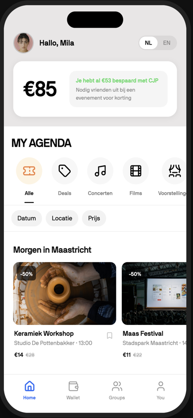
A subsidised card with no reason to open it.
CJP is the Dutch youth cultural pass. A subsidised card that gives people under thirty discounted access to museums, concerts, and events across the Netherlands. The brand had reach. The app did not. It was a thin ticket wallet with no discovery layer, no social features, and no reason to open it between purchases.
Users renewed the card once, used it twice, and forgot it existed. The cultural sector was losing its most direct channel to the audience it most wanted to reach.
The uncomfortable part: the value was already there. The discounts were real, the catalogue was deep, the subsidy did its job. What was missing was not a better deal but a reason to care. The app treated culture the way a bank app treats money, as something to administer. Nobody under thirty opens an admin tool for fun.
Nobody goes to a museum alone at nineteen.
Looking at how this generation actually decides to go out, one pattern kept returning. Culture is social before it is cultural. A concert happens because a group chat decided it would. An exhibition gets visited because someone posted it. The decision is collective, the memory is shared, and the friction is coordination, not price.
The existing app was built for a solitary user who already knew what they wanted to see. That user barely exists. The real user is standing in a group of four, negotiating a plan. An app that only serves the moment of purchase misses every moment where the decision is actually made.
Going to culture, as a shared act.
The solution was to reframe the app around the act of going, not the act of buying. Personalised discovery based on what each user actually cares about. Transparent CJP pricing on every card. A social layer that lets groups coordinate plans and split purchases. A cultural passport that turns attendance into identity.
Each piece answers a specific failure of the old app. Discovery answers the empty feed. Transparent pricing makes the subsidy visible at the exact moment it matters, on the event card, not buried in a checkout. The social layer moves the group chat negotiation inside the product. The passport gives every visit a residue, something that accumulates and is worth showing.
The wallet became a motivation layer instead of a payment tool. The reason to open the app stopped being the next ticket and became the next thing worth seeing.
Designed in code, from the first hour.
There was no static mockup phase. The concept went straight into a working app: onboarding, personalised home feed, event pages, group invites, the passport. Every screen was designed in the medium it would live in, with real interactions and real motion, so every design question got answered by using the thing rather than imagining it.
Agentic tooling made that pace possible. The scaffolding, navigation plumbing and state wiring were delegated to the machine, while the design decisions, what the feed prioritises, how an invite feels to receive, what a streak looks like when it breaks, stayed human. Three days from concept to an app you could hand someone.
The prototype embedded on this page is that build. It is not a video of the idea. It is the idea, running.
A working app in the room, instead of a deck.
In three days I built a fully interactive, production quality prototype the team could put in front of the client and actually experience, not just describe. Early stakeholder alignment happened over a working app, not a stack of static mockups. The prototype drove the decision to pursue the social and gamification direction.
That changes the nature of the meeting. A deck invites opinions about pictures. A working app invites reactions to an experience, and reactions are better data. Watching a stakeholder tap through the passport told the team more than any slide of it could.
The shape of the role made it possible. A design engineer designing and building in the same loop, with agentic tooling absorbing the scaffolding work, turns a research conversation into something the client can hold in their hand.