Dekmantel Festival
An app designed to guide festival-goers and electronic music fans through the world of Dekmantel
All-year long
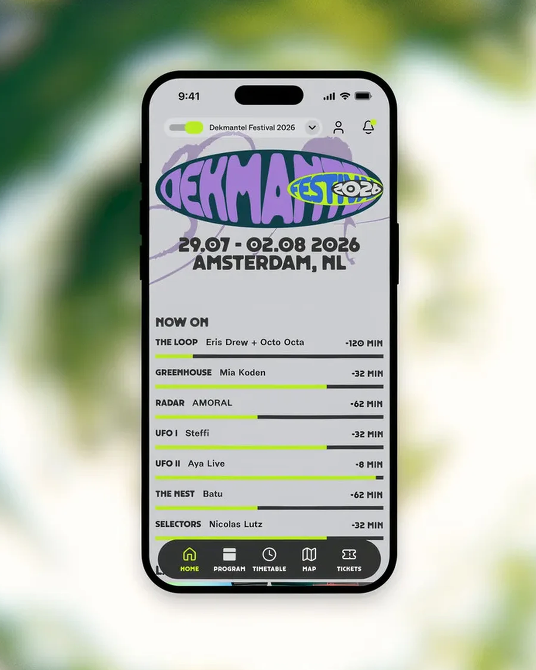
Dekmantel is not only a festival for one week a year. It is also a music label, a dj mix series and a publisher. The app is designed to be both a really functional tool for festival goers, but also a hub which stores and invites users to explore the wider world of Dekmantel.
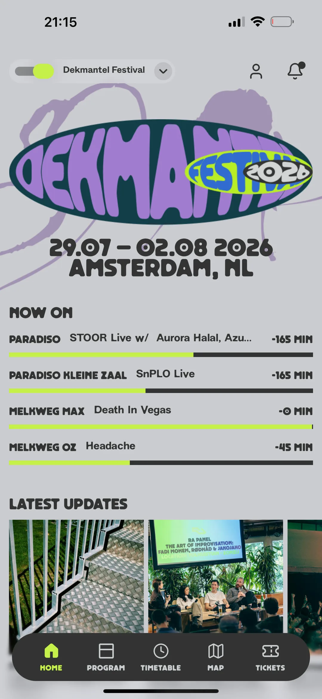
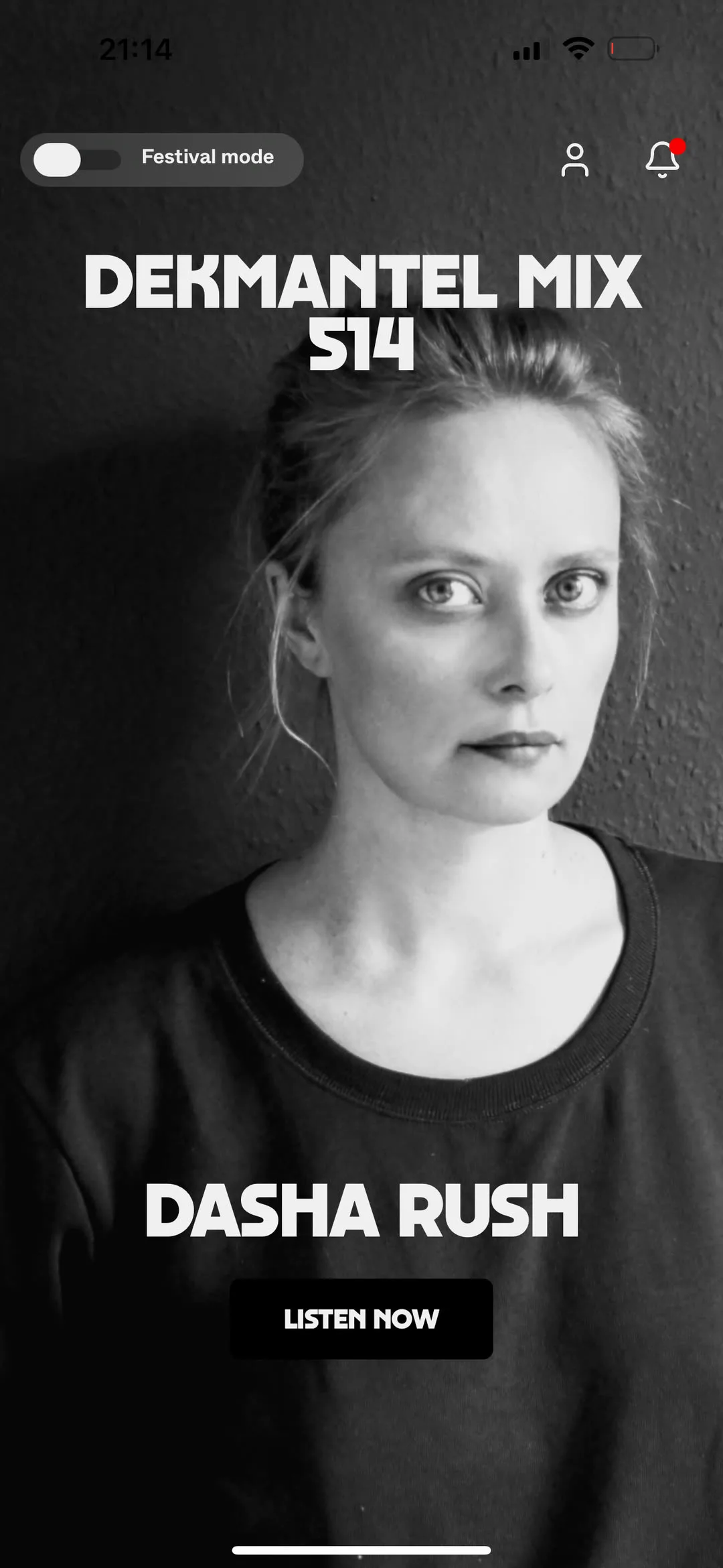
With festival mode on, shown on the left, the screen tells you what is playing now, on which stage, and how far into the set you are. Switch it off and the same screen slows down to full-bleed artwork and one thing to listen to.
In the field
The brand, designed by Jonathan Castro, was made for posters, and a poster has your full attention. An app gets a glance, in daylight, one-handed. These two screens are designed for that glance.
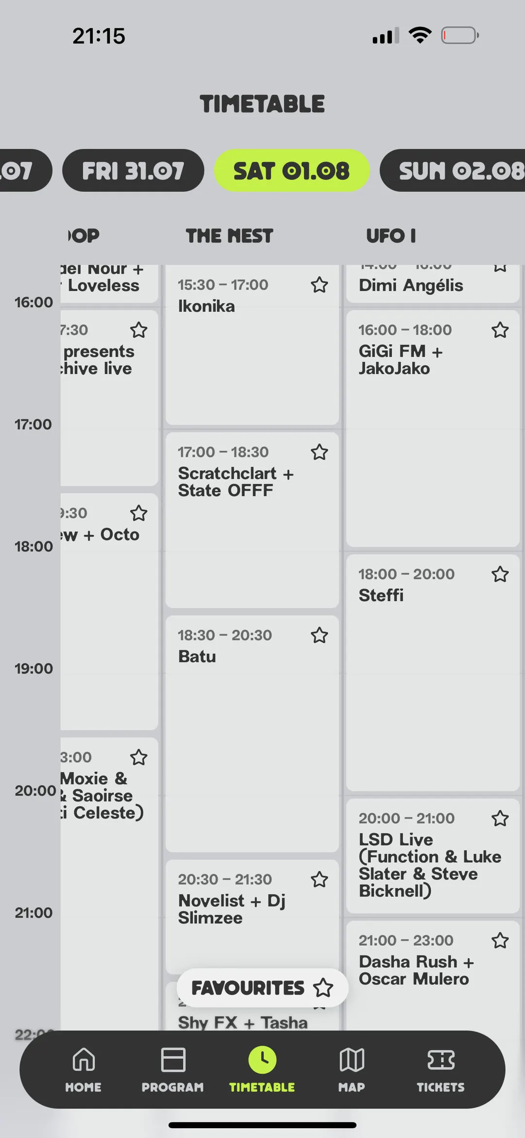
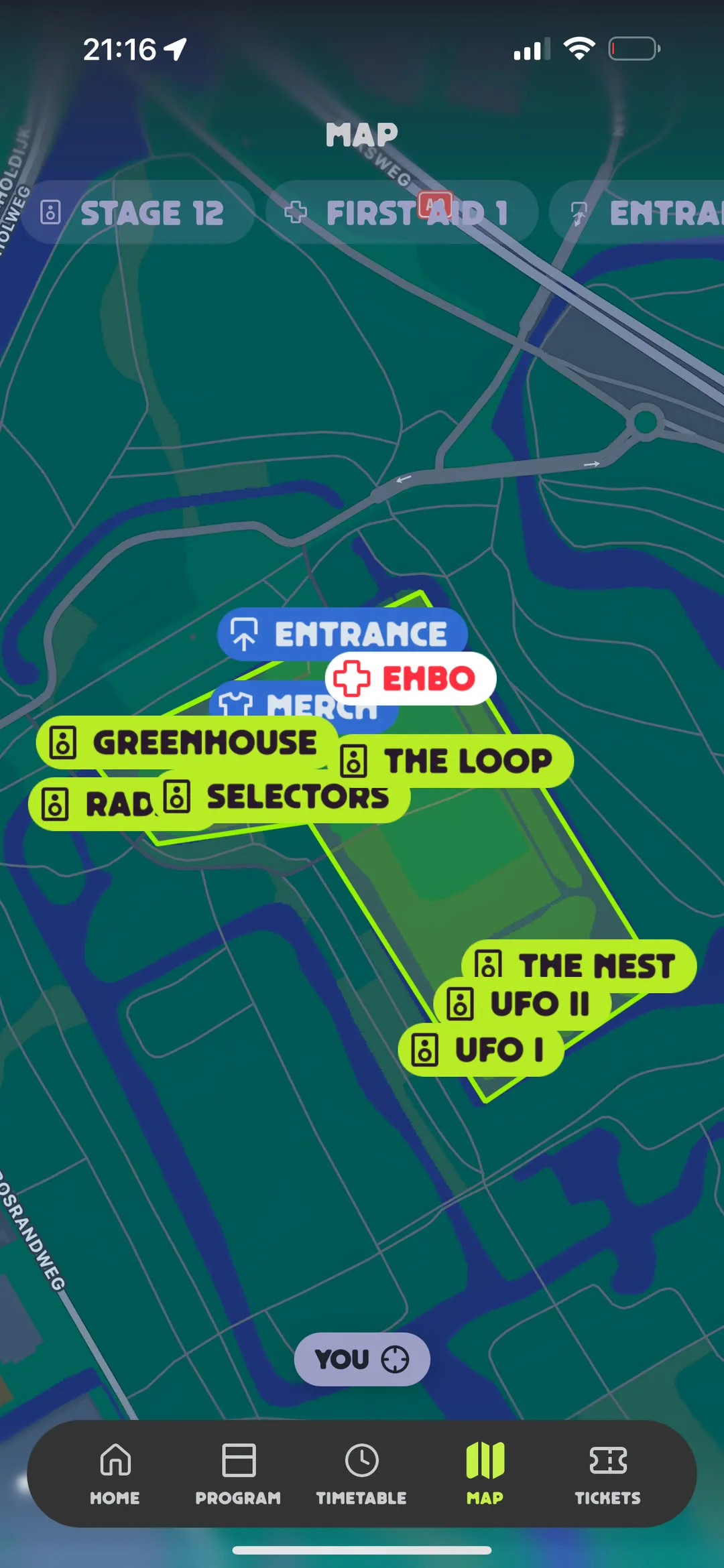
So set progress is a bar rather than a number, because how much is left is the only question anyone asks. The timetable runs as parallel columns so a clash shows before it happens. The map uses one marker shape for everything and coded it by kind: acid for stages, blue for the practical, white with a red cross for first aid. The one you need in a hurry should not look like the rest.
Filtering
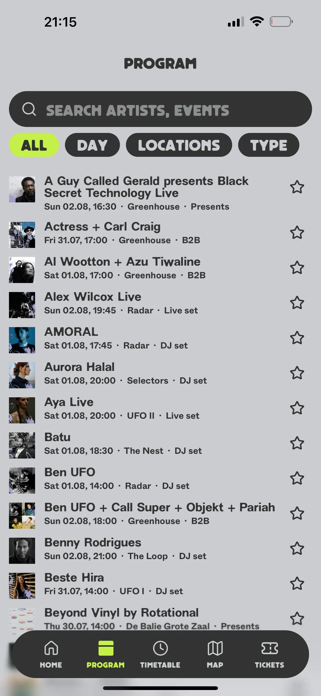
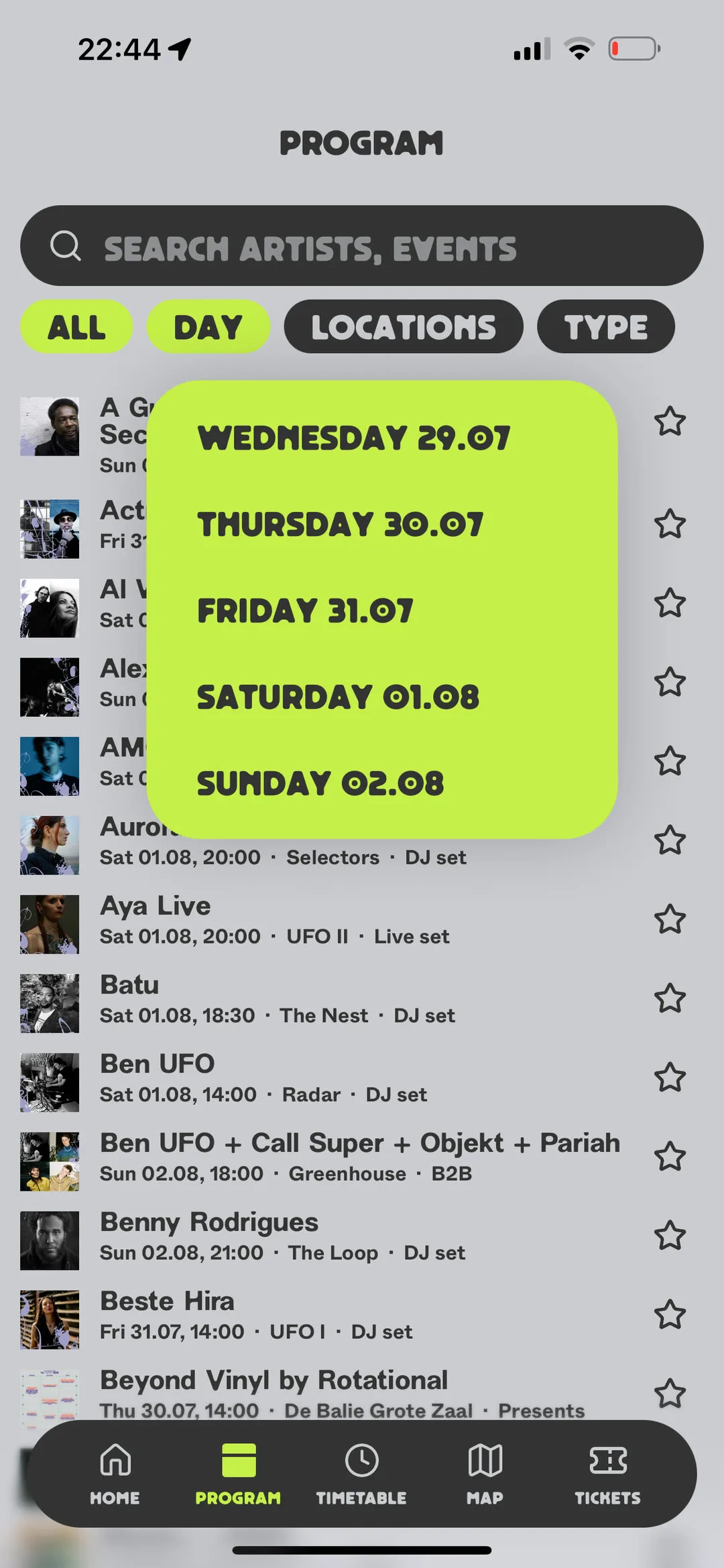
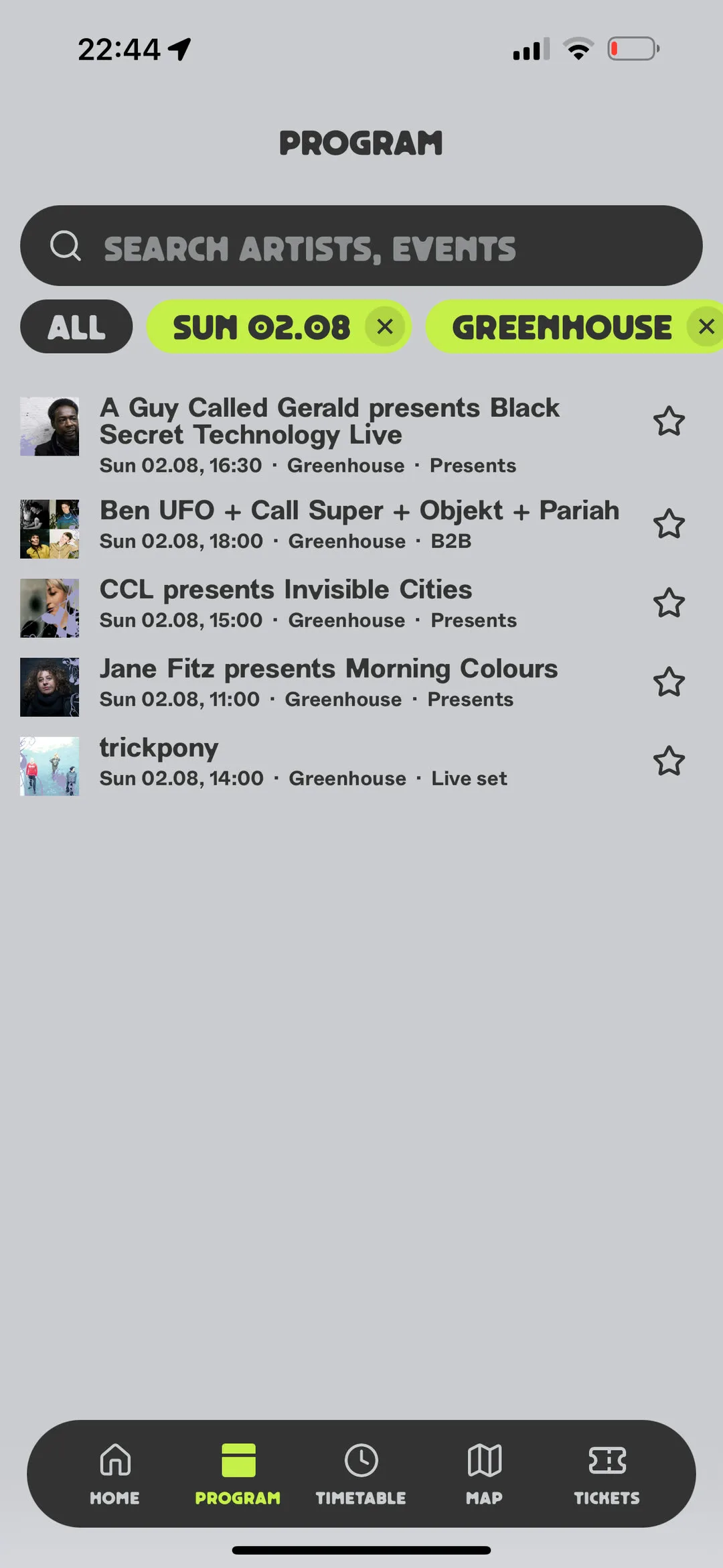
A festival programme is a wall of names, and most of them are not for you. Filtering is how someone turns that wall into their own weekend, so it had to feel less like operating a search and more like saying what you are in the mood for.
That meant the app should always be able to answer one question at a glance: what is on, and what did I ask for. So a single colour carries those two meanings and nothing else, and the whole filter is built as one pill that opens, holds your choice, and lets you take it back. Choices stack, because people build a night out one decision at a time rather than all at once.
Designed for discovery
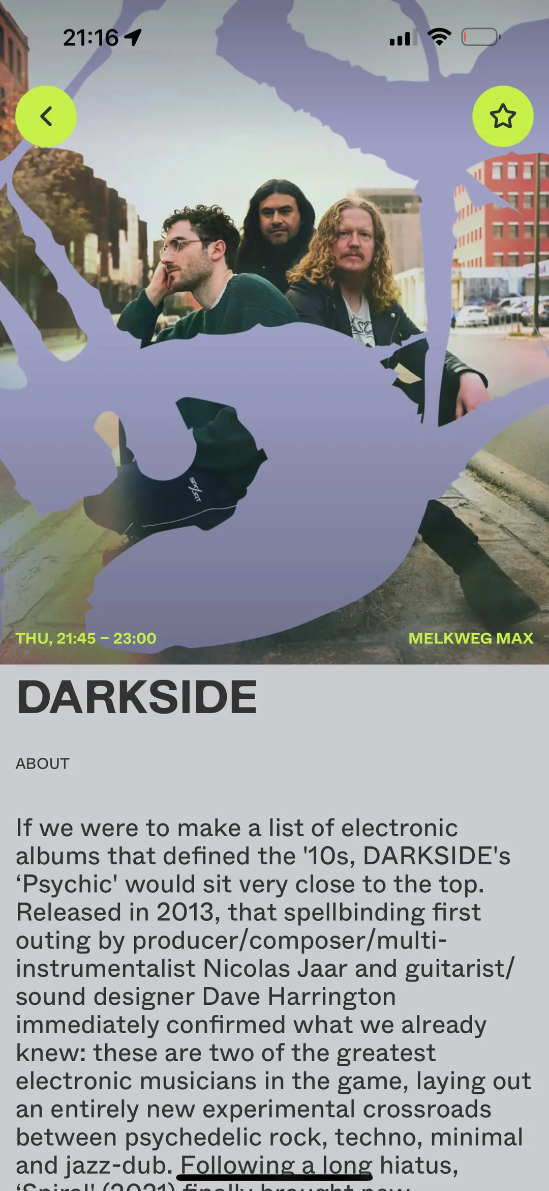
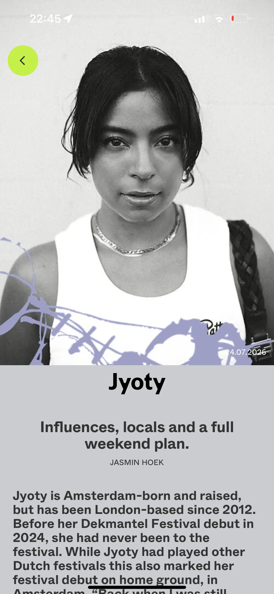
One of the most valuable things the app does is help people discover new artists at the festival, and let them get curious quickly by putting how the music sounds first, with links straight to it.
So on the artist page and the feature below, the brand steps back and lets the writing and the photography lead. It is the same system, asking for a different kind of attention. A brand that can hold a long read as well as it holds a poster is one that can carry the rest of the year, not just the week of the festival.