Reinaerde
A website for a care organisation with more than 200 locations, designed so every visitor finds their own path.
Context
Reinaerde supports people with an intellectual disability across the province of Utrecht, in every phase of life. At 25 years old it arrived at a new brand promise: Jij kiest je pad, wij lopen met je mee. You choose your path, we walk with you. The website is where that promise meets someone actually looking for care. Clients, relatives, referrers and volunteers all come through the same front door. Each has a different question, and often a hard one.
Finding your way
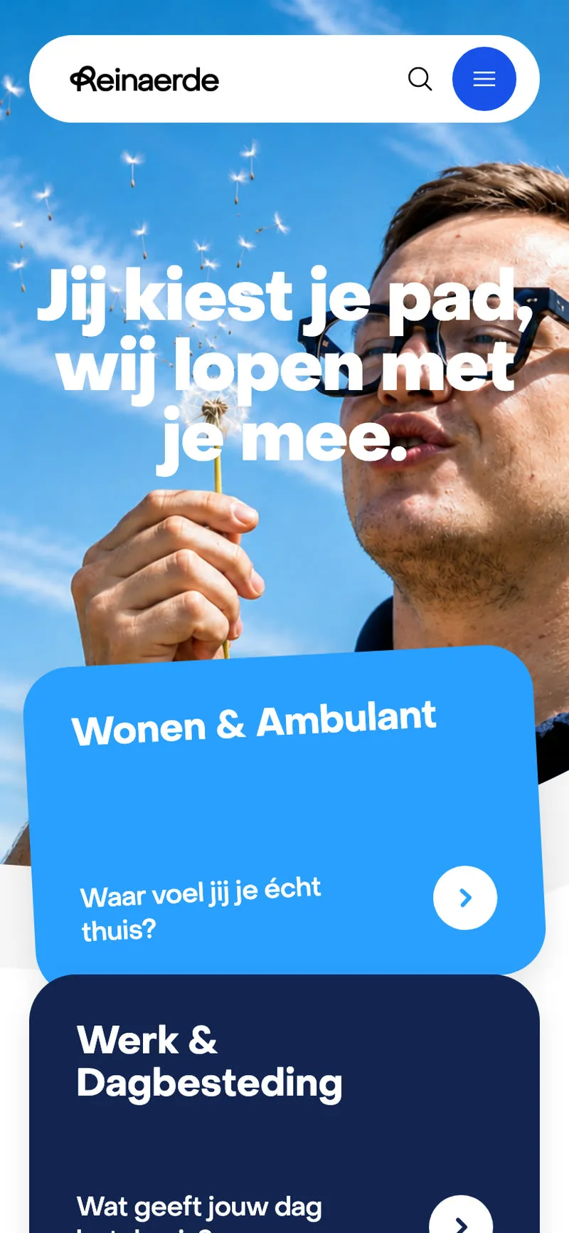
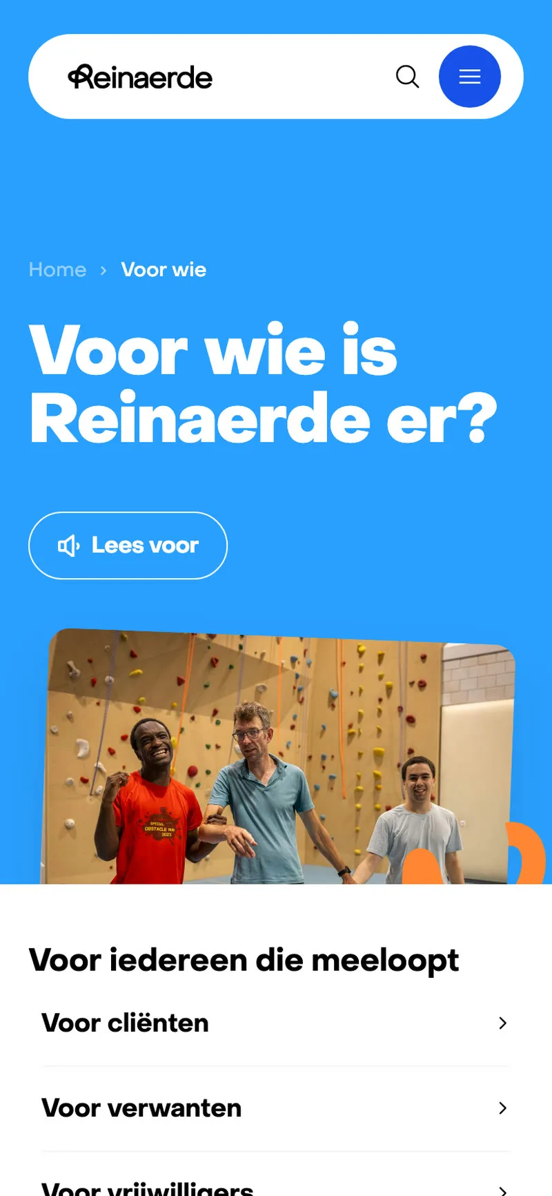
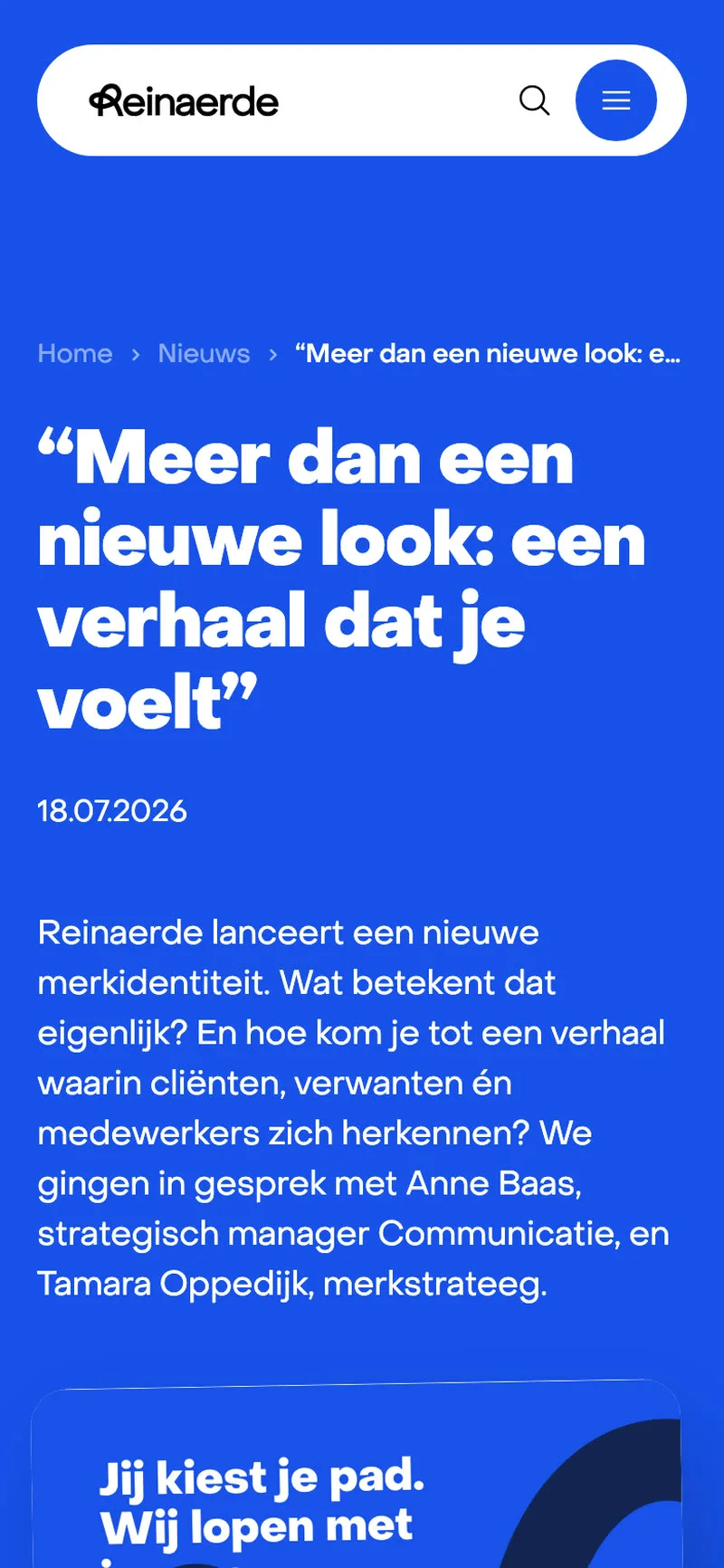
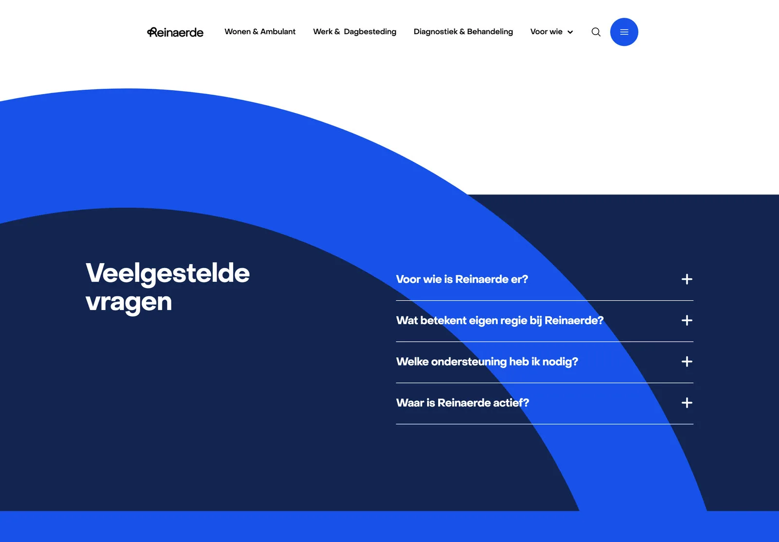
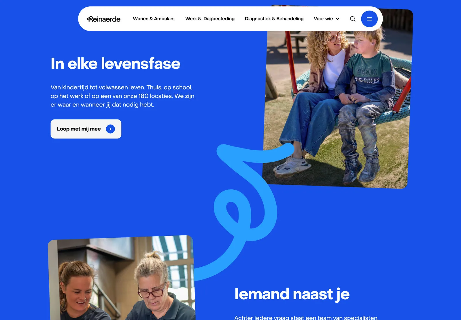
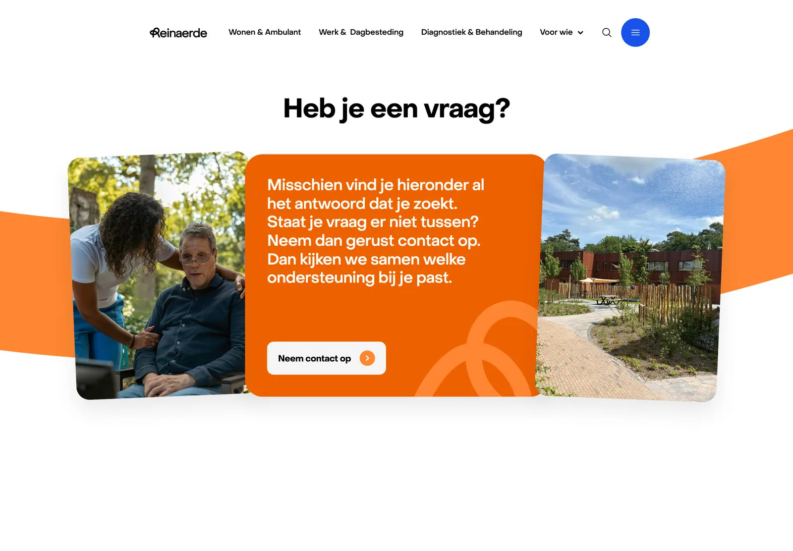
Someone searching for care rarely knows how a care organisation is put together, so the site never asks them to. The home page opens on three entrances, each phrased as the question a visitor already has, with a second layer underneath that sorts by who you are: client, relative, referrer or volunteer. Every page ends the same way, with the questions people really ask and one clear way to get in touch, so nobody lands at a dead end.
System
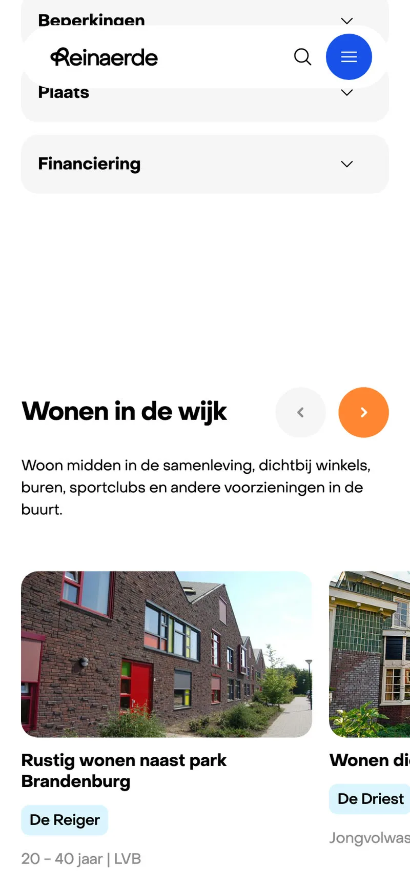
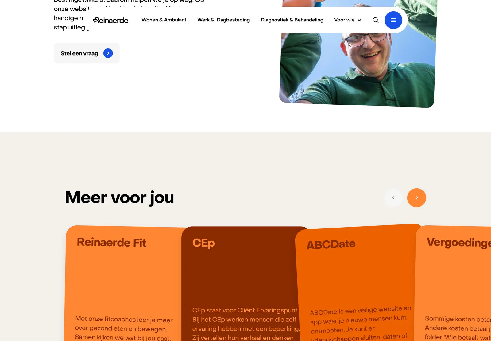
Under the sitemap sits a small set of page templates and a library of blocks that editors combine themselves, so a new location or treatment page comes out looking designed without a designer in the room. The listings filter by age, disability, place and funding, because with 200 locations the question is never whether Reinaerde has a place, it is which one fits.
The sitemap, the templates and the block library were designed, then built as a working prototype so the client could judge the site in a browser rather than on a slide. Motion, hover and the way sections flow into each other were settled there, before the build started.

Tone
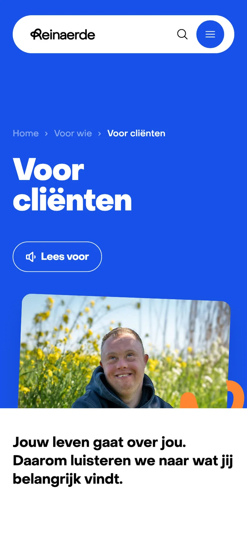
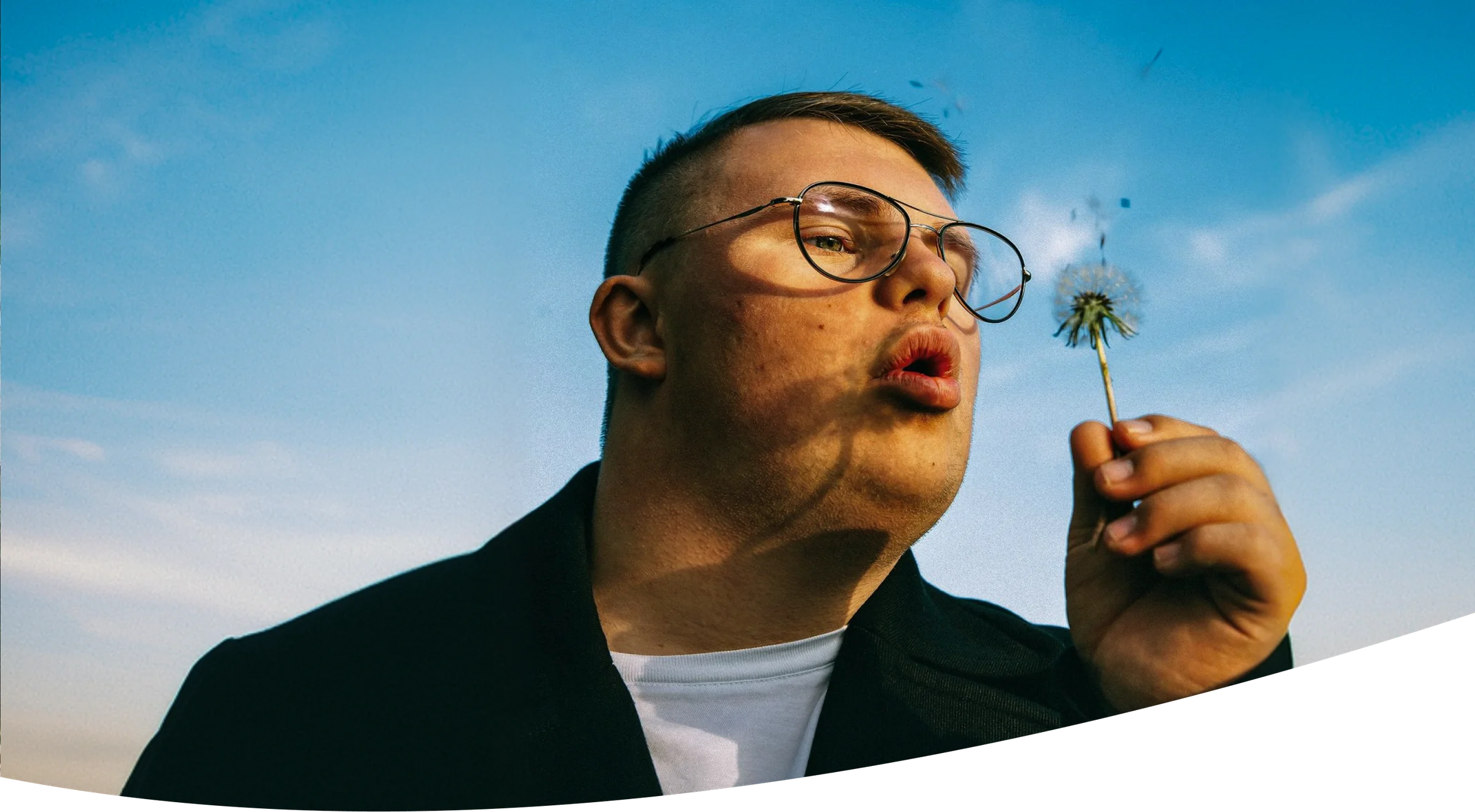
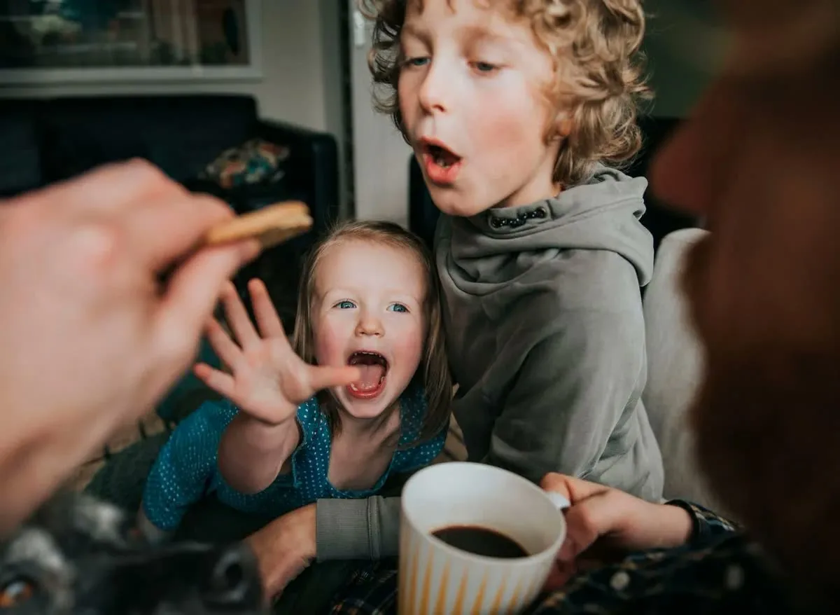
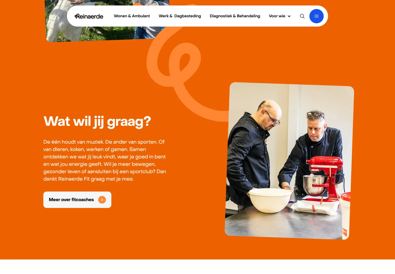
The refreshed identity keeps Reinaerde’s blue and orange and adds a line running through the letter R: a life path, with turns in it. That line is the only decorative element on the site. The photos are rotated slightly, like prints left on a table, and sections meet in soft curves rather than hard edges. The photography is real people at real locations. Orange is held back for the moments that speak to a client directly, so it stays warm instead of loud.
Accessibility
Many visitors have an intellectual disability, or are reading on behalf of someone who does. So the language stays plain and the sentences short, the headings are set large, and a Lees voor button on every page reads it aloud. The frequently asked questions sit at the bottom of each page in the visitor’s own words. On a phone the same blocks stack into one column, with the three entrances still first.